

If you're building a website for your brand, soon you'll probably be wondering how to optimize it. But, what does it actually mean to have a well-optimized website?
“Optimization” isn’t a one-dimensional process involving only one goal. Instead, there are many types of optimization. For instance, you can optimize your website for SEO, but also for accessibility. And while there may be some common ground for both of these processes, their goals are very different.
In this post, we’ll dive into conversion rate optimization. We’ll share:
- What is conversion rate optimization and how it makes a difference
- The 10 most common mistakes hurting your conversion rate (and how to fix them)
While our key takeaways may be useful for teams across industries, we’ll particularly focus on the SaaS sector.
Without further ado, let’s get started.
What Is Conversion Rate Optimization (CRO)?
Conversion rate optimization (CRO) is the systematic effort to improve the conversion rate of a website or landing page. CRO is a data-driven approach that involves testing different elements on a website or landing page to see which combination of elements leads to the highest conversion rate.
CRO also involves:
- Identifying key areas of improvement on a website or landing page
- Prioritizing those areas based on their potential impact
- Creating test hypotheses based on those areas
- Conducting A/B tests to validate or invalidate those hypotheses
- Applying the learnings from those tests to improve conversion rates
In short, CRO removes friction from the user experience to maximize conversions.
Now you’ve got a clear definition of what CRO means. So let’s get your CRO efforts started with a list of 10 mistakes that may be hurting your conversion rate.
The 10 Most Common Website Optimization Mistakes (& How to Fix Them)
In this section, we’ll get into some of the most common CRO optimization mistakes. We’ll also dive into some lesser-known ones that we think deserve a closer look.
Make sure you’re not:

- Using too many interactive elements
- Being vague about your product actually is
- Forgetting to track micro-conversions
- Giving the user too much information, at all once
- Using too many call-to-actions, with no clear hierarchy
- Taking too much time to provide value
- Using non-descriptive images that take too much space
- Giving unclear steps to conversion
- Building conversion flows with too many steps
- Failing to deliver after conversion
Let’s dive in!
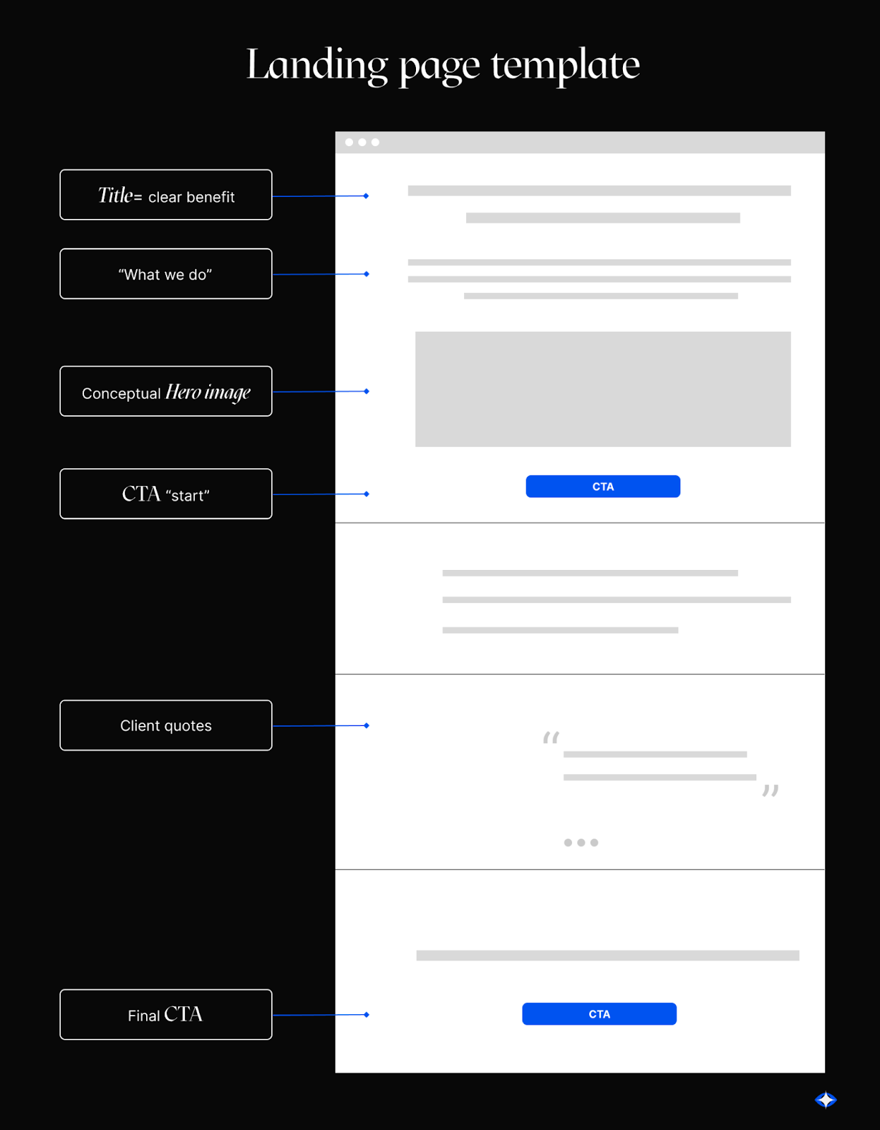
Using too many interactive elements
Landing pages are crucial for making an engaging first impression on new visitors, and they're very useful for generating leads as well. However, a poorly optimized page can have the exact opposite effect. Especially if your landing page has an excess of elements that, instead of guiding the visitor on the right path, contaminate the user experience.
Let's take a closer look at some landing elements that can be overwhelming for visitors,as well as some best practices you can apply.

Be very careful when it comes to:
- Intrusive cookie banners: Cookie consent banners are rarely optional, but you can keep it minimal & minimize all other elements adding unnecessary “noise” to your website.
- An overly invasive support/chat bot widget: Configure your chatbot so it’s as noninvasive as possible.
- Auto-playing video: Don’t include auto-playing videos - or at least mute them by default.
- Irritating “Subscribe to our newsletter” pop-ups: Only include your newsletter subscription pop-up within your blog, and don’t show it as soon as a user enters the page. Only use pop-ups when users are highly likely to convert.
Most of the time,an excess of interactive elements distracts the user, causing them to wonder why they got to your website in the first place. While it may seem like a lie, pop-ups, interactive videos, and intrusive banners are likely to turn them off from learning more about your service.
And remember that, aside from clutter, most of these interactive elements add weight to your website, making it load slower than it could. And, on top of that, these elements often add avoidable accessibility challenges. So, keep in mind that “Good things, when short, are twice as good” and make your landing pages as simple as possible. Don’t interrupt your users - they may be on the road to conversion.
Being Vague About What Your Product Actually Is
B2B SaaS companies operating on very specialized niches are especially likely to make this mistake. When people visit your website, you only have a few seconds to make a good first impression. If they don't really understand what your product’s about (and how it’d benefit them), they'll leave and never come back.
Make sure your website provides clear messaging about your product or service (or any other value proposition).
We recommend you:
- Use clear language. Don’t try to bring attention to every little aspect of your value proposition, make sure to be 100% clear about what your product actually is and what problems it’s made to solve
- Mind your tone. Use a conversational tone - or the tone that best matches your brand. But don’t be too matter-of-fact, mechanical, or bland.
- Use specificity strategically. If you want to be specific, first ask yourself if you're being clear & accessible. Be specific about those parts of your product that your users ask you about the most.
- Get creative with features & benefits. Mix and match your pros to strengthen your pitch.
- Say what you mean, concretely.. Explain how you’ll fulfill your promises. Use concrete language and avoid buzzwords.
Not Tracking Micro-Conversions
In most cases, conversions aren’t just a short, direct trip from your homepage to your payment gateway. There are many intermediary steps, where users say “I’m interested, tell me more” or “I think you may have what I’m looking for”. By not tracking the steps that users take prior to converting, you’re:
- Missing out on your actual user journey.
- Overseeing potential conversion roadblocks.
Some examples of micro-conversions are:
- Newsletter subscriptions
- eBook downloads
- Visits to your “Pricing” page
- Visits to your “Schedule a demo” page
- Visits to specific landing pages
By tracking micro-conversions, you’ll be able to improve the user experience so that, upon the next visit, users can quickly find what they need and take the next step. Plus, it’s a great first step to developing a marketing strategy that’s based on actual user behavior.
Too Much Information, All At Once
Too many interactive elements can overwhelm and immobilize your users. And too much information can have the same effect. So, make sure you’re giving your users just what they need to know at every step of their journey.
Make an effort to:
- Go from “general but engaging” to “informational and specific”. At the top of the page, go from an eye-catching but self-explanatory synthesis of your value proposition, and slowly move the user toward an in-depth explanation.
- Target objections at every step of the way. Especially, close to each call-to-action (CTA).
Poor CTA Hierarchy
Your primary CTAs are the actions you’d like users to take in a best-case scenario.
Usually, homepages have several goals and different calls to action (CTAs). For instance, you might want visitors to your homepage to fill out a contact form. Or get to know your features. Or try your product for free. On a landing page, however, there's usually one goal (which inspires your primary CTAs), and a secondary CTAs.
Basically:
- Your primary CTA is a button to facilitate instant conversions. For instance: Book a demo.
- Your secondary CTAs help you address any frictions and engage users that need extra information to convert. For instance: Learn more.
Thus, when it comes to landing pages, you want to make it visually clear to your users which is your main CTA and which is your secondary CTAs. Give your primary CTA a privileged position on your landing page. For instance, we’re big fans of sticky sidebars with a clear conversion button.
Limit your CTAs, establish a clear visual (& strategic) hierarchy, and stick to it. Otherwise, your users will just see too many buttons, leading them in different directions, and will go into decision paralysis.
Too Much Time to Value
Reducing the time-to-value implies that as soon as users start reading your content (be it a blog post, landing page, or any other resource), they'll find valuable information that solves their problem.
If the time to value is too long, users will probably decide to:
- Stop reading and abandon the page
- Search for a more direct alternative
Remember that people usually don't search haphazardly on Google, they always do it to reach a specific goal - even if that goal is just learning more about their hobby.
Strip your content from all those things that are making it longer without helping your user reach their goals.
For instance, if your introduction includes an example of a hypothetical situation, ensure that it’s rich in information and contributes 100% to helping your user. Otherwise, it would be better to just remove it.
Using Non-Descriptive Images That Take Too Much Space
Images can slow down your website significantly, so make sure every image is worth it.
Especially if your product is too specific and abstract (and especially if you’re pre-launch), it’s quite common to include images that don’t really add value.
And, in some instances, these images could even confuse your user.
We recommend you:
- Pick images that highlight your product’s impact (stay away from generic illustration packs and pictures of people smiling in front of computers)
- Add accurate and descriptive alt tags
- Keep your images as light as possible (under 1 MB, ideally)
Unclear Steps to Conversion
If users don't know what they need to do to convert, they're less likely to actually convert. By giving users a clear idea of what they need to do, you increase the chances that they will take the desired course.
Too Many Steps to Conversion
A user who has to go through an overwhelming number of steps to get your solution will most likely feel frustrated and gravitate towards your competition. If you can minimize friction and save your users time, make the change. And check whether each screen in your funnel accurately explains to the user what they need to do and what they will find next.
For instance, if you’re capturing emails through a lead magnet, your users will likely go through three steps:
- Clicking a CTA on your landing page
- Filling a subscription form
- Receiving a welcome email with the resource they’re interested in
In that case, you may want to:
- Include the subscription form directly on your landing page
- Reduce the number of fields on your subscription form
That small change alone could turn 3 steps into 2, reducing your drop-off rate.
Nothing Happens After Conversion
Most of the mistakes on this list are the result of conflating goals from different teams, designing your funnels in a haste, and trying too many things at once. But this one is often the result of negligence.
Sometimes, users may sign up for your newsletter or your waiting list and receive nothing in return. No, not even a welcome email. In some cases, pre-launch teams receive tons of emails from interested early adopters, but don’t do anything to build loyalty among them. Not only is this a waste of resources, it’s precisely what you should avoid.

Luckily, life doesn’t end when your leads give you their email. Nurturing your leads with valuable content is key to a successful lead generation strategy.
That’s It!
Congrats! You may already be on the right path to building a high-conversion online platform. CRO is a noble, ongoing effort for growth teams. But CRO may feel like rowing in the mud if your website wasn't designed for conversion in the first place.
Do you need help creating a beautiful, rankable, and low-code website? You may be in the right place. Book a free discovery call today.